TerraCycle motion design standards
Creative Direction, Strategic Development, Design Oversight
As TerraCycle’s brand matured, we identified a need for consistent, flexible motion design standards that could scale across teams, regions, and partner campaigns. While our visual identity was well-established in print and static media, motion remained loosely defined—often reinvented from project to project.
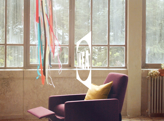
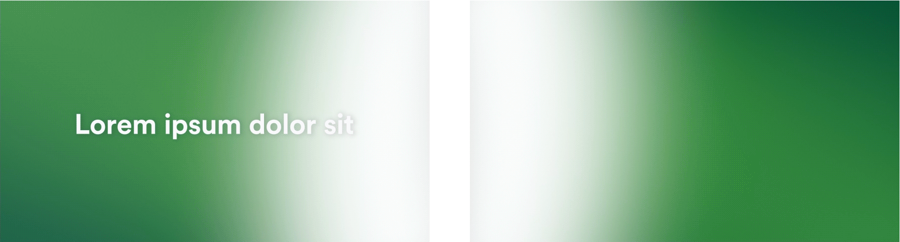
I led the development of TerraCycle’s first global motion design system: a toolkit that translates our brand’s personality into dynamic movement. These standards guide everything from logo bumpers and typography to transitions, animated icons, and partnership integrations—allowing creative teams to move faster while staying on-brand. The system builds directly on our existing brand language, extending it into motion without reinventing the look and feel. For example, below you’ll see a static promotional visual alongside its motion counterpart—same message, same design—elevated through animation.
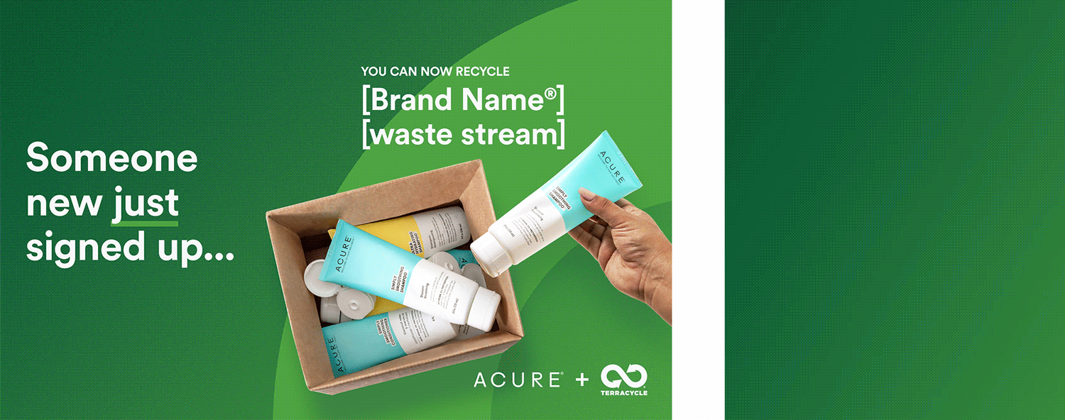
A direct comparison: the same visual language applied in static and motion formats. The animation version builds on the established brand style, enhancing it with movement, pacing, and tone.
Defining a Motion Language
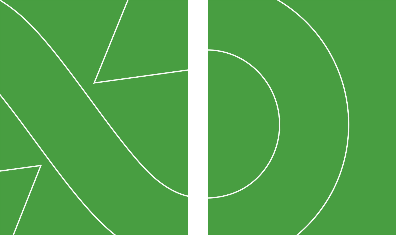
The foundation of our motion system is drawn from the TerraCycle logomark: a dynamic double arrow that inspired the movement principles of linear and curvilinear motion. These principles form the visual rhythm of our animations, ensuring that even the most subtle motion feels intentional and on-brand.
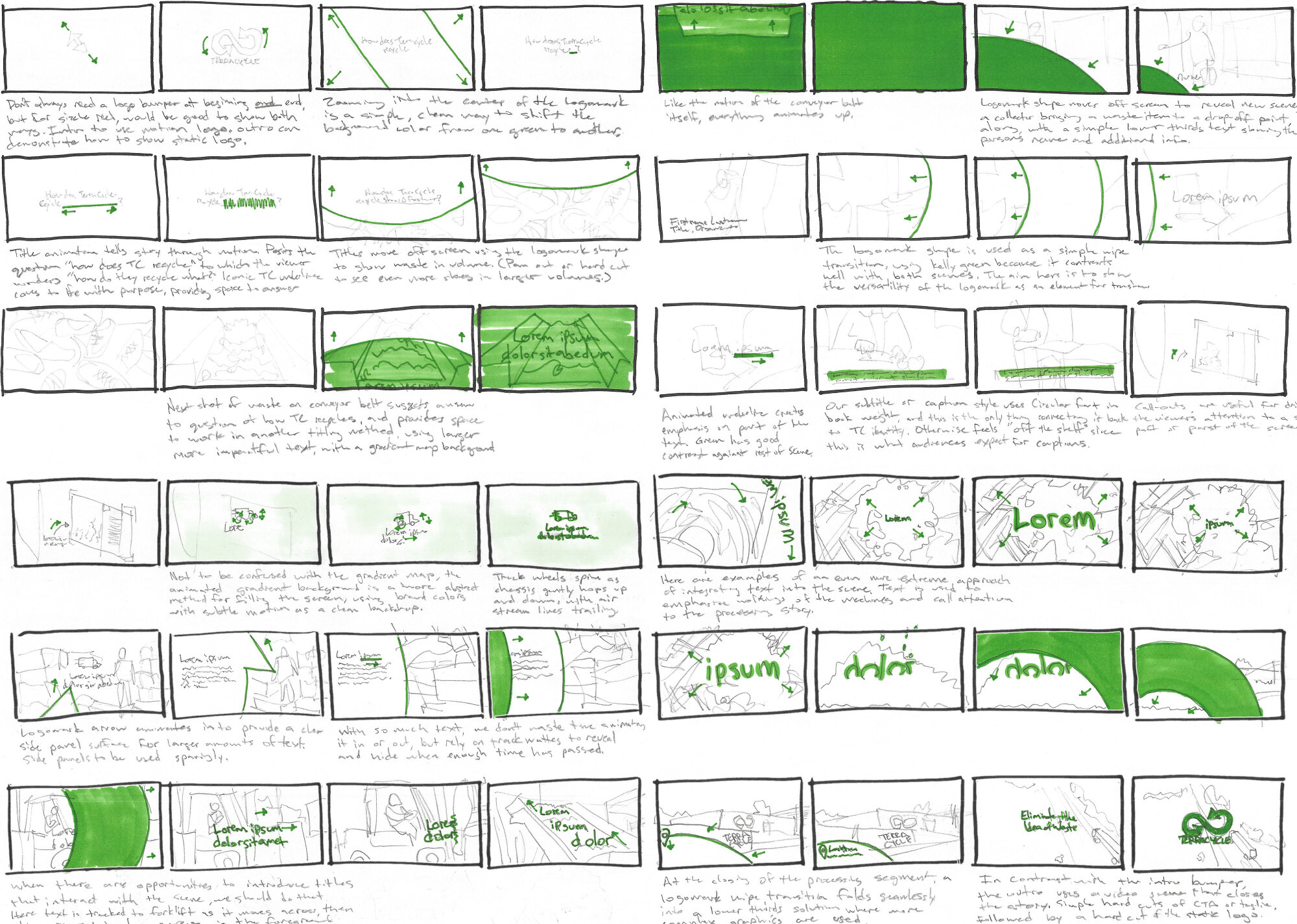
Storyboarding the System
To bring these principles to life, I sketched out a storyboard that served as both a creative reference and art direction for our motion designer. This formed the basis of our motion sizzle reel, a showcase of TerraCycle's animated identity in action.
The Motion Logo
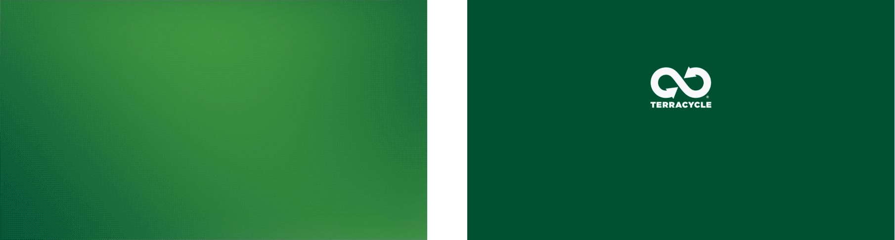
At the heart of our system is the animated TerraCycle logo. Available in Bottle Green, Kelly Green, and Off-White, the motion logo acts as a window, often used at the beginning or end of videos to signal brand ownership. It must always contrast clearly with its background for maximum legibility.

Customizable animated lockups extend our visual identity into co-branded partnerships, ensuring TerraCycle remains recognizable and integrated.
Logo Bumpers & Intros/Outros
Different pacing requires different treatments. For longer or slower videos, the animated logo is a natural choice. When speed is critical, static bumpers maintain brand clarity without disrupting the rhythm.
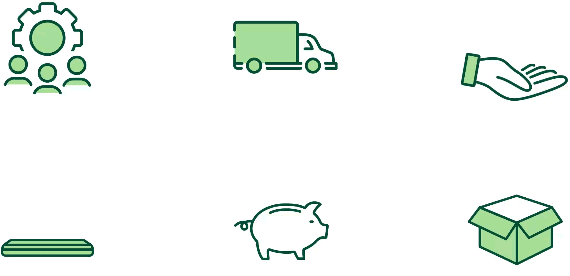
Animated Icons & Elements
We brought static iconography to life by animating key elements in subtle, looping sequences. These micro-interactions highlight meaning and add personality while retaining clarity and accessibility.
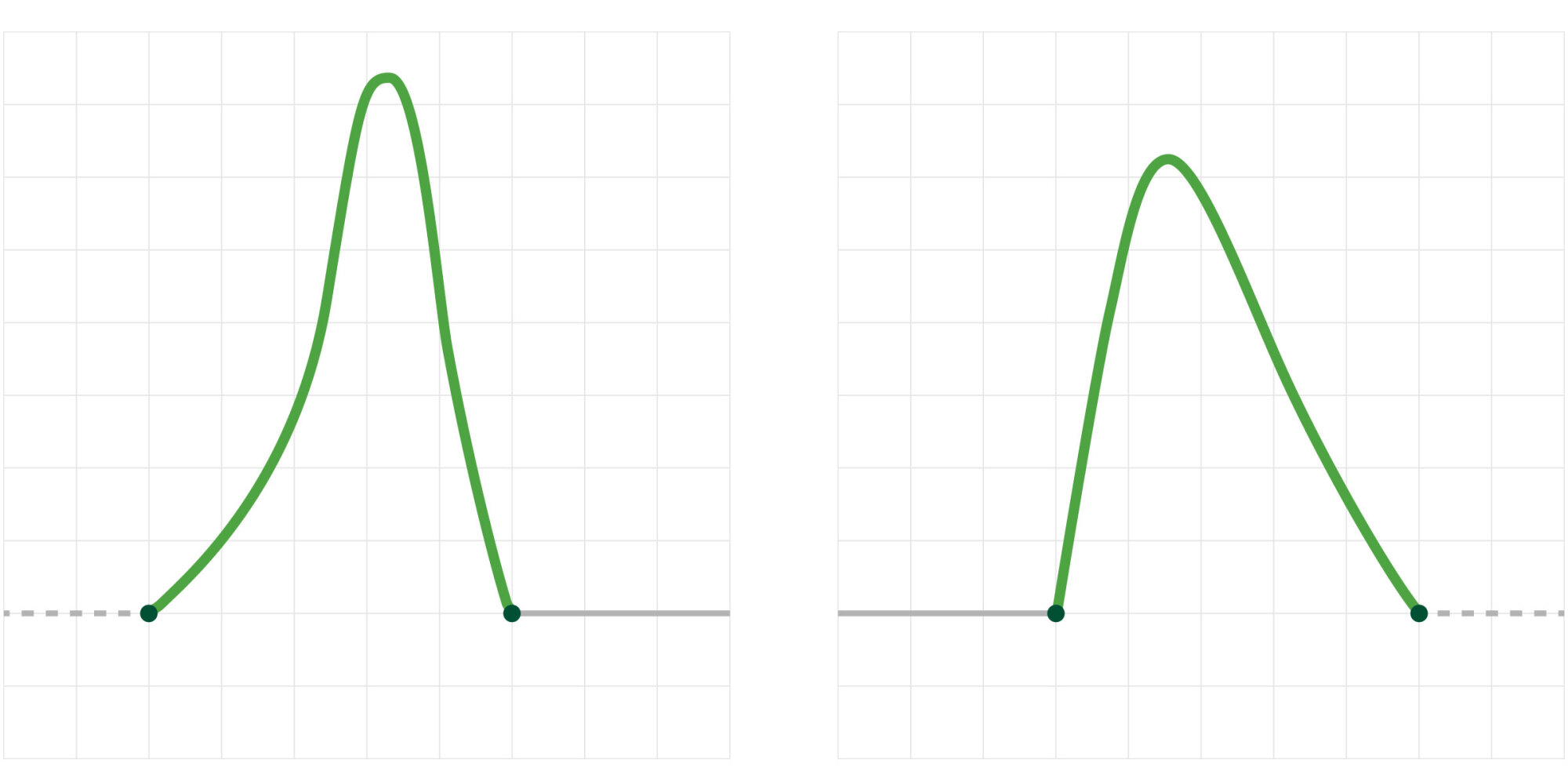
Motion Timing & Easing
Subtlety in motion is crucial. Our underlines, transitions, and supporting animations use easing curves tailored to match our tone—smooth, deliberate, and approachable.
Global Adoption
To ensure global consistency, I partnered with our Creative Director, motion designer, and marketing leads to review iterations, gain alignment, and champion the rollout. The result is a flexible system now used across North America, Europe, and beyond—empowering our teams to tell more cohesive, dynamic stories with animation.
Outcome
By codifying motion design standards, we enabled teams across TerraCycle to produce consistent, brand-aligned animated content with greater speed and clarity. The system is now used across multiple business units and partner campaigns, supporting a wide range of formats—from social clips and explainer videos to trade show loops and email headers. Since rollout, internal review rounds for video content have decreased by over 40%, thanks to clearer creative expectations and alignment across stakeholders. Designers feel more confident executing motion assets, and feedback cycles are shorter and more focused.