Loop brand standards
Loop is TerraCycle's reusable packaging platform that launched globally in 2019. It enables consumers to get brand-name products they already use and love, but in durable packaging that can be returned, cleaned, refilled, and put back on the shelf. The goal is to make circularity convenient.
As Loop grew, so did its network of brand and retail partners. But without published brand standards, clients were left without clear direction on how to communicate the Loop concept—what it is, how it works, and why it matters in solving the problem of waste. Marketing and packaging content created in partnership with brands often took on the visual identity of those partners, leaving Loop underrepresented and, at times, inconsistently presented across different touchpoints. Recognizing the need for clarity and cohesion, I set out to establish a set of standards that would not only guide our in-house team but also serve as a toolkit for our expanding list of partners.
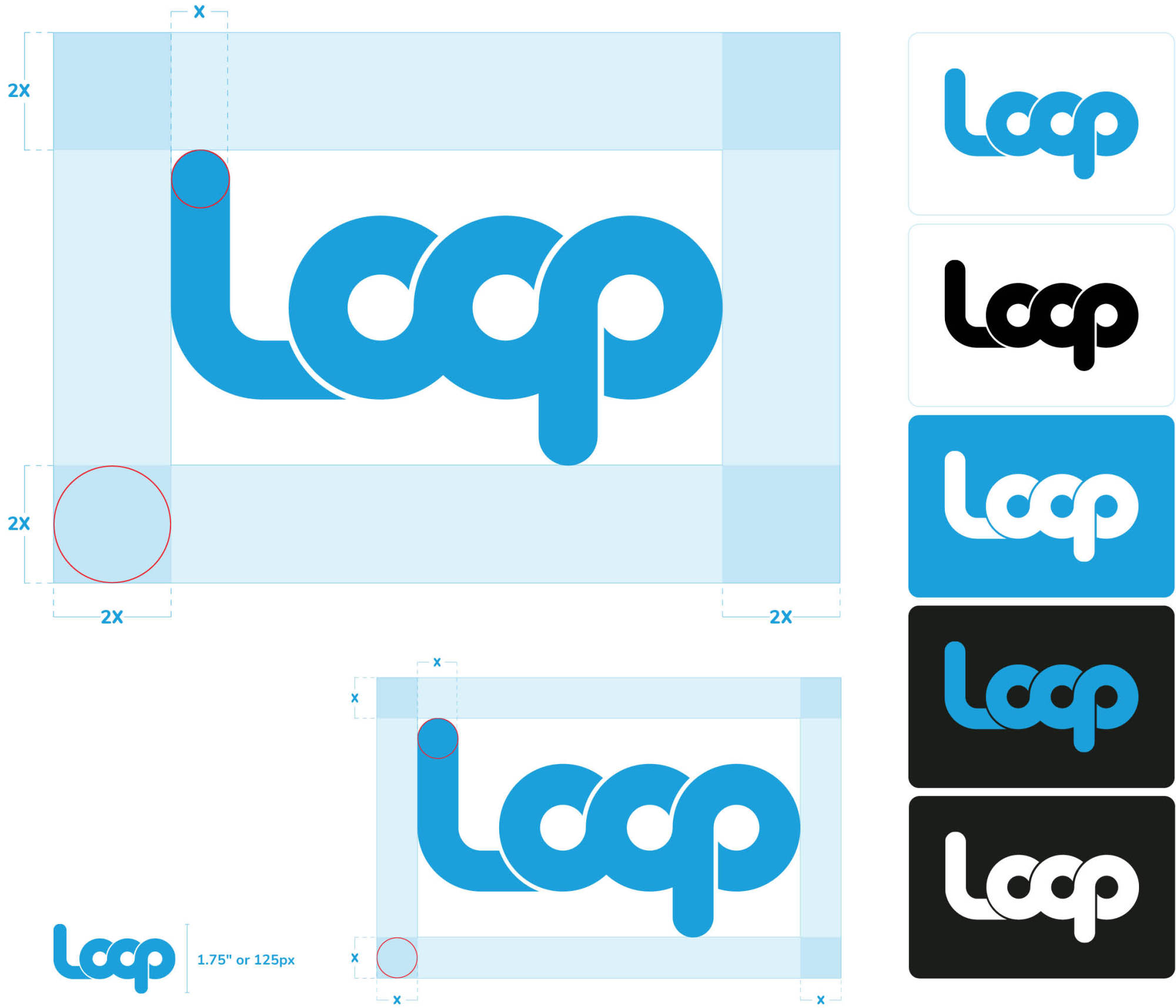
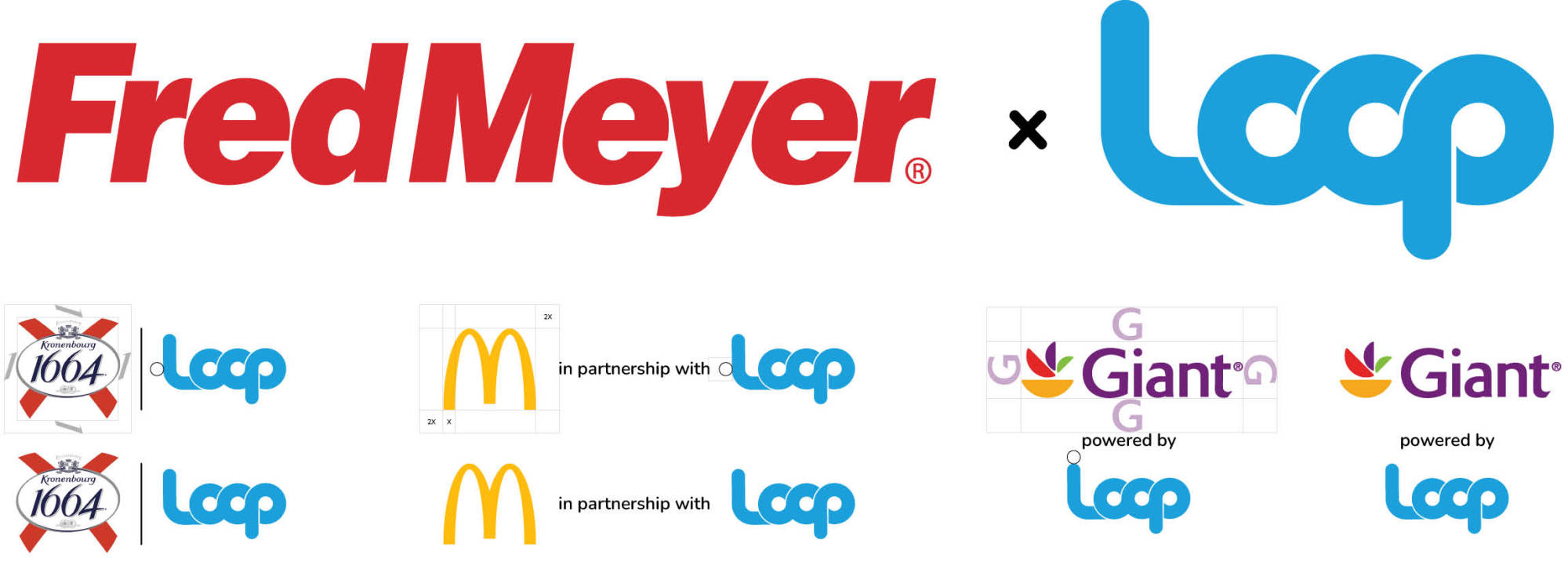
One of the first areas to address was the use of the Loop logo. Previously, clear space requirements were more relaxed, leading to compositions that felt cramped or unbalanced. This also resulted in inconsistencies across applications, as both internal designers and external partners treated the logo differently depending on the context. By defining stricter clear space rules and standardizing how the logo appears in partner lockups, we ensured that Loop maintained a strong, recognizable presence
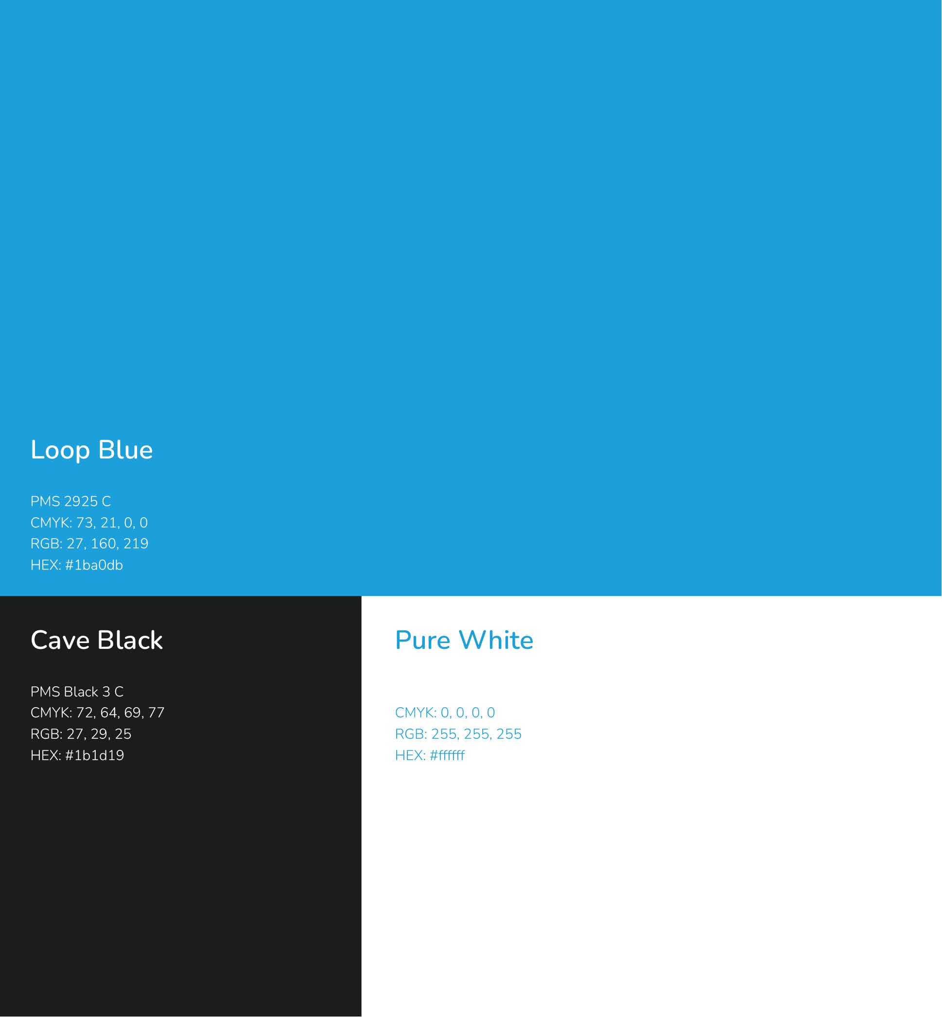
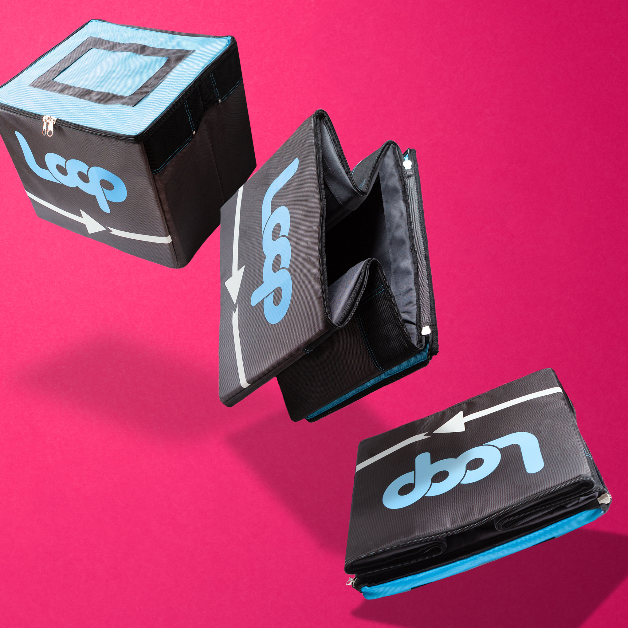
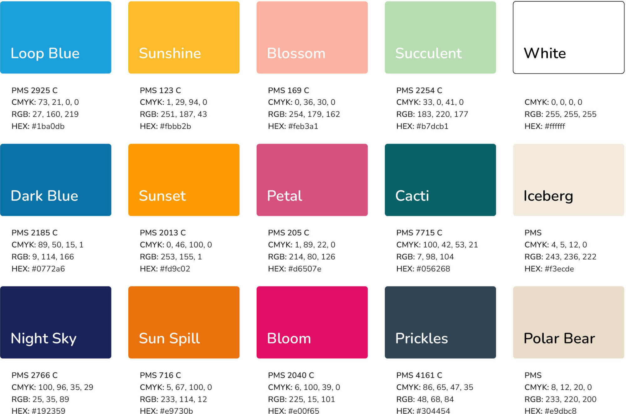
Color was another essential element. While Loop's primary colors—light blue, black, and white—were well established, the brand was beginning to feel clinical and predictable. To inject more vibrancy and flexibility, I developed a secondary palette that brought warmth and contrast to Loop's visual system. The impact of this can be seen in how the Loop shipping tote, designed with our core brand colors, comes to life when placed against a backdrop from the expanded color system.
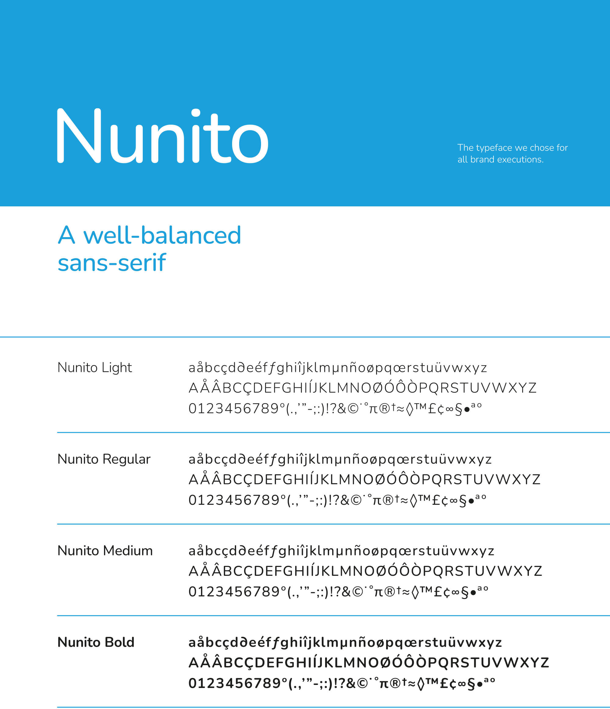
Typography played a key role in reinforcing the brand's identity. We selected Nunito for its rounded forms, which pair well with the soft, circular nature of the Loop logo. As a variable-weight typeface, Nunito provided the flexibility to create contrast and hierarchy while maintaining a cohesive look across all applications.
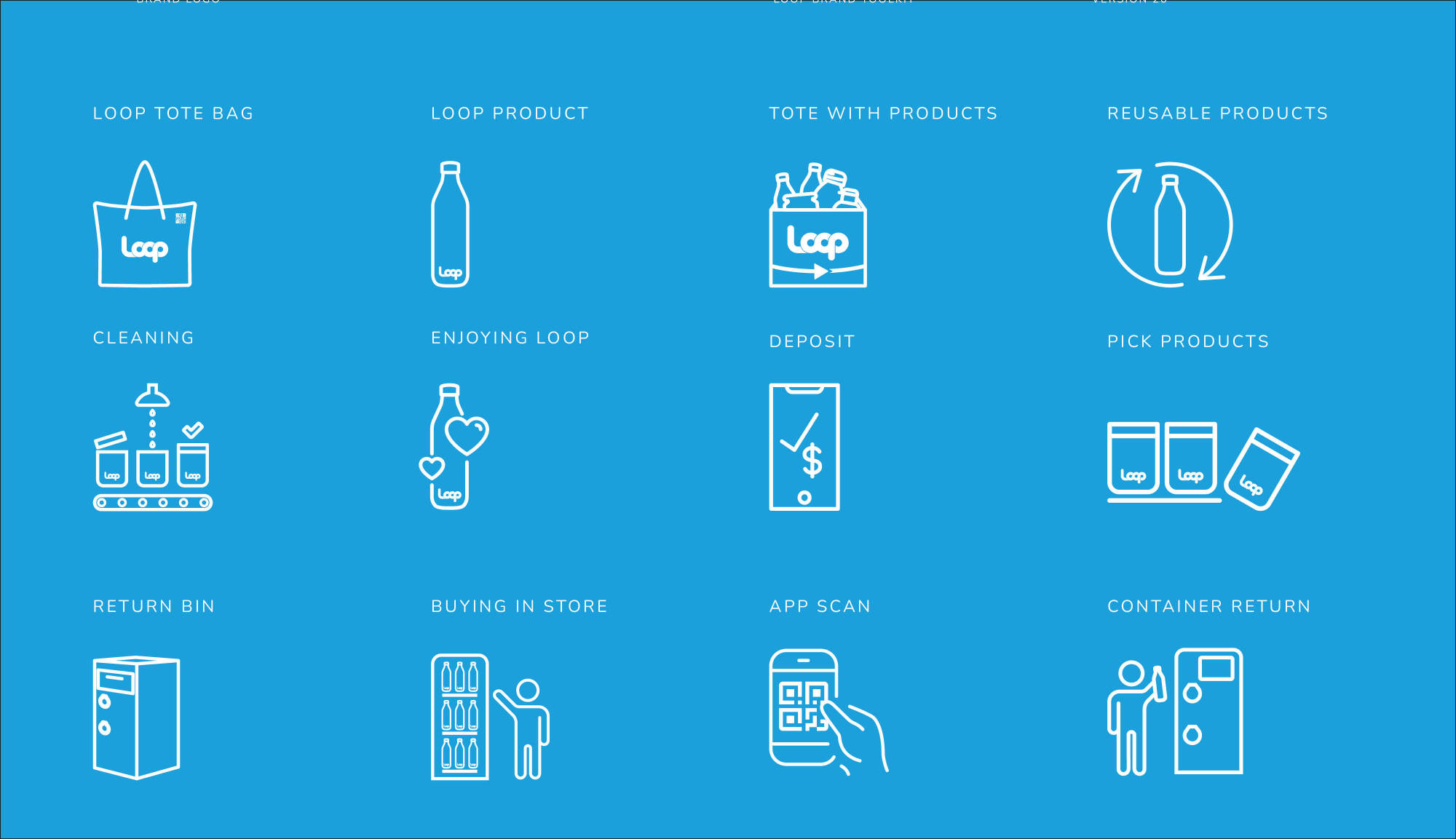
Iconography is an integral component of Loop's identity, appearing everywhere from digital interfaces to product labels. To maintain clarity and consistency, we established a unified style—thick outlines, rounded shapes, and a limited color palette of Loop blue, black, and white. The result was a flexible system of over 250 unique icons that reinforced the brand's visual identity while remaining highly adaptable across different contexts.
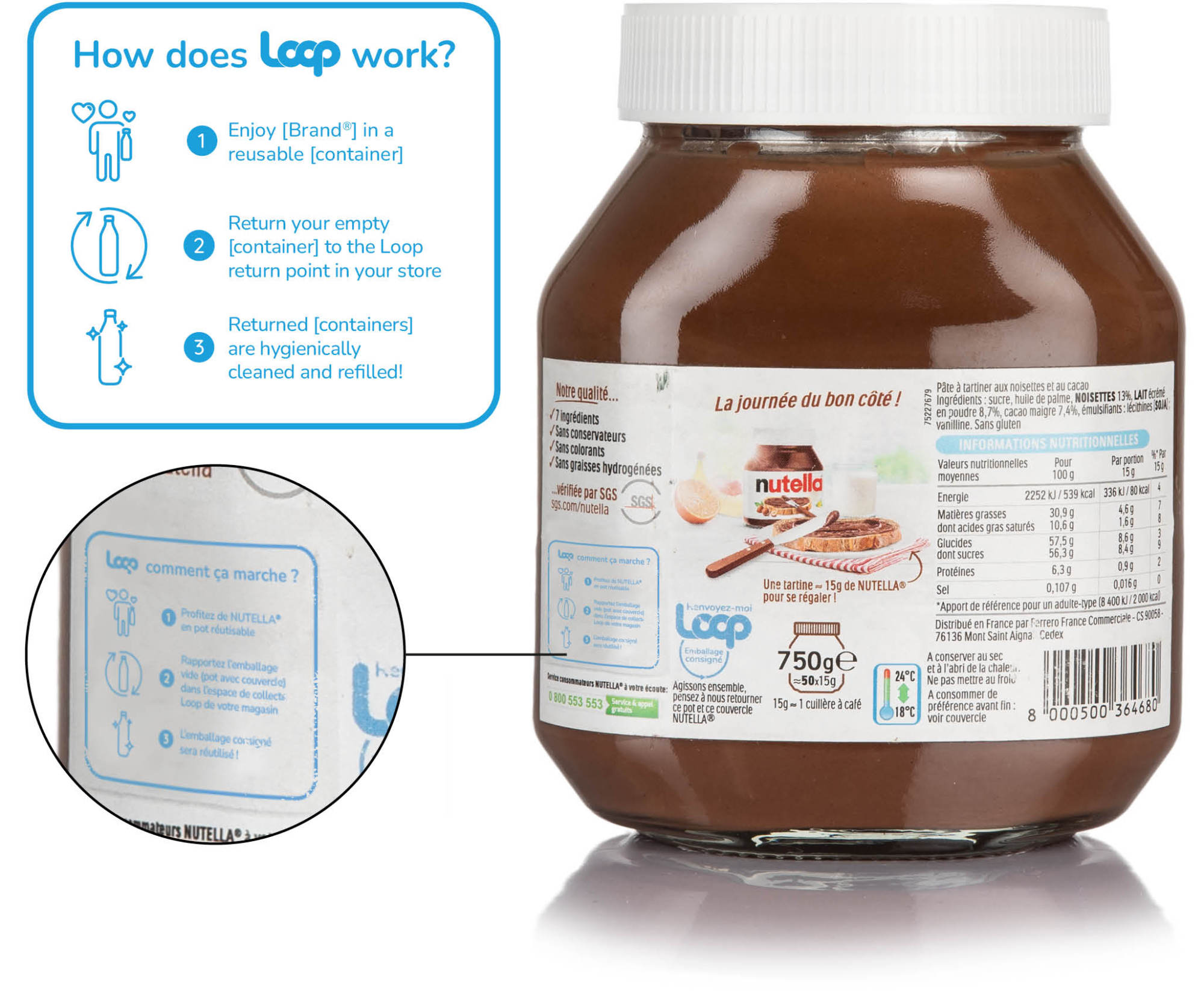
We developed a range of adaptable marketing assets tailored to both Loop's own channels and those of our brand and retail partners. A key focus was ensuring that the How Loop Works messaging remained clear, regardless of format. Since steps for returning a container could vary between e-commerce and brick-and-mortar solutions, we created modular messaging that could be customized without losing clarity. The challenge was to maintain flexibility while preserving Loop's core identity, ensuring that customers always understood the return process at a glance.
Our messaging framework accommodates variations based on marketing channels and retail environments. For example, return instructions differ between e-commerce and in-store purchases, requiring adaptable messaging strategies. The contrast between a small packaging label and an expansive digital retail display highlights how storytelling scales across different formats.
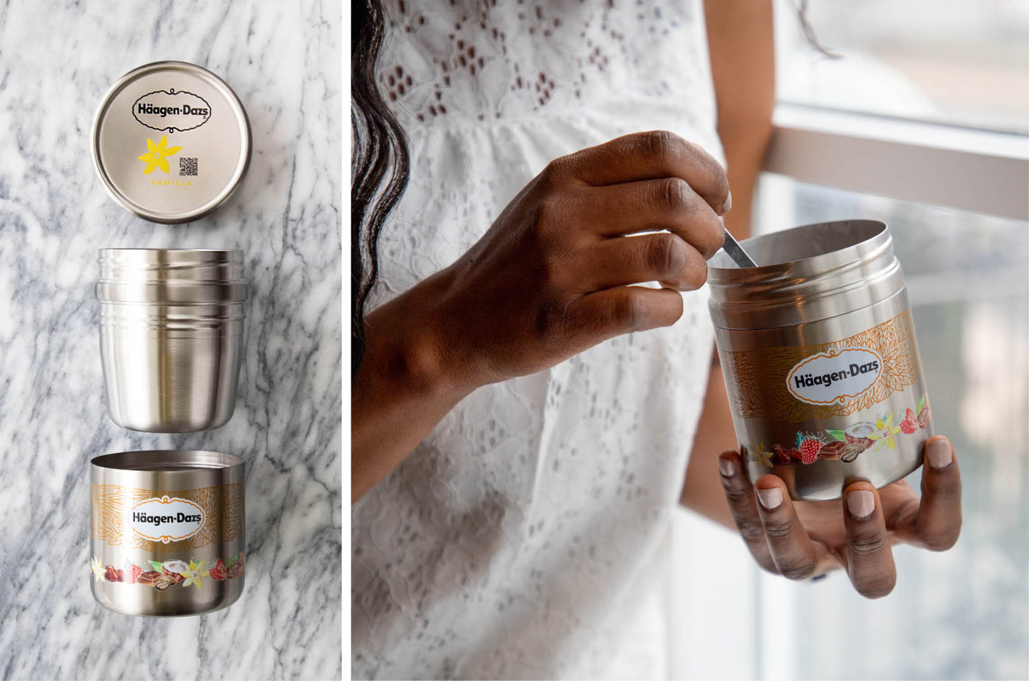
A consistent photographic style was crucial in making Loop's packaging and products recognizable across all channels. Working with my photography partner, we established best practices for brand partners to generate pack shots and lifestyle images that felt cohesive within the Loop ecosystem. These standards helped maintain visual harmony across a growing number of brand partnerships, reinforcing Loop's identity in both digital and retail spaces.
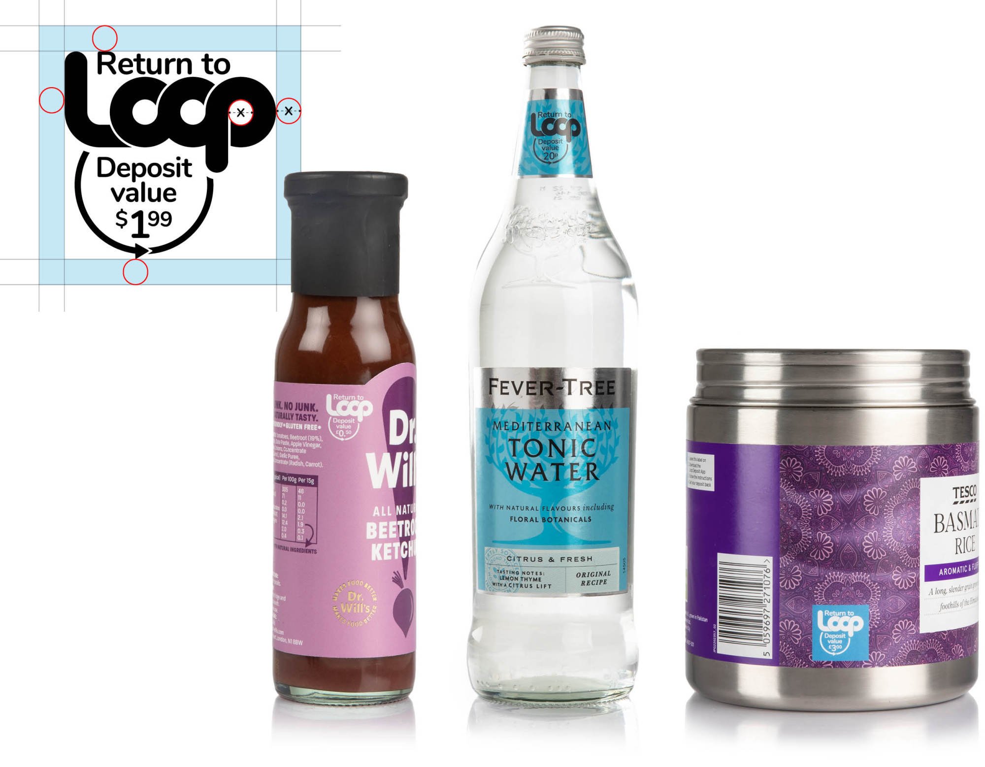
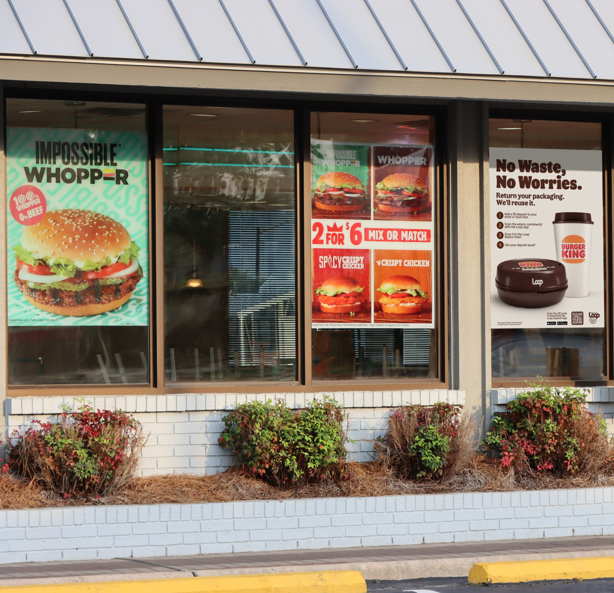
One of the most critical brand applications was packaging. Every product in the Loop ecosystem required a Return to Loop deposit symbol, communicating that the packaging was designed for reuse. Because label space is often limited, we worked closely with brand partners to ensure that this message was prioritized. The deposit system was central to the Loop experience, and getting this detail right was key to reinforcing customer behavior and understanding.
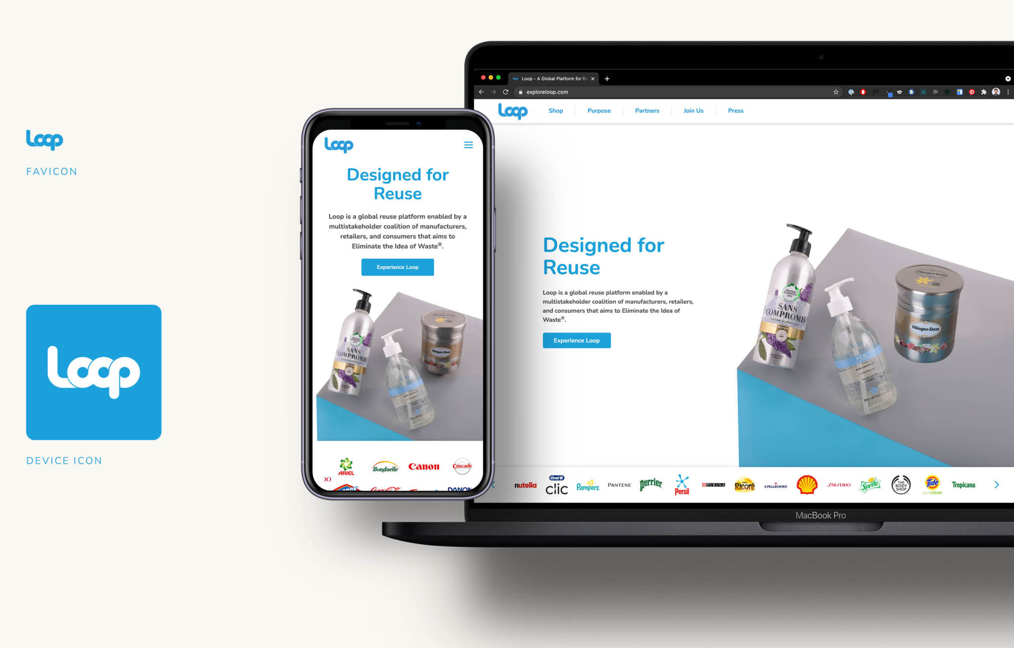
To unify Loop's digital presence, we developed a robust UI kit that was implemented for exploreloop.com and continues to serve as a reference for future retail partner e-commerce platforms. The goal was to ensure that the visual language carried over from marketing to digital interactions, creating a smooth, intuitive experience that felt unmistakably Loop.
In physical retail environments, the customer journey needed to be mapped carefully to guide awareness and behavior. We categorized key touchpoints into two primary objectives:
• Driving awareness: This occurs early in the journey, through marketing efforts such as email, social media, and in-store promotions that prepare customers before they engage with the system.
• Explaining how it works: This happens at the point of interaction, whether on a packaging label or at a return bin.
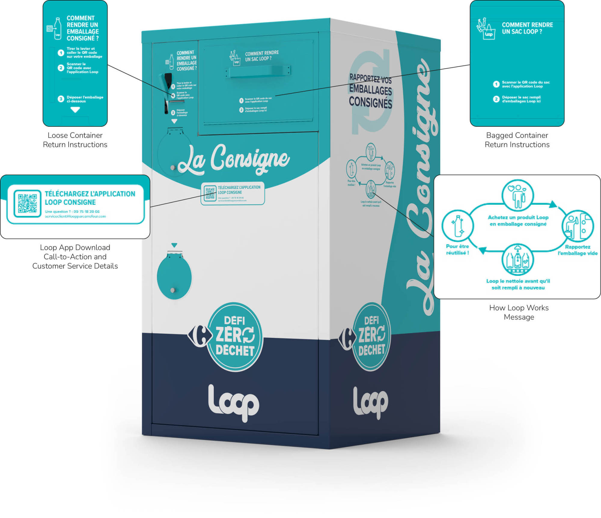
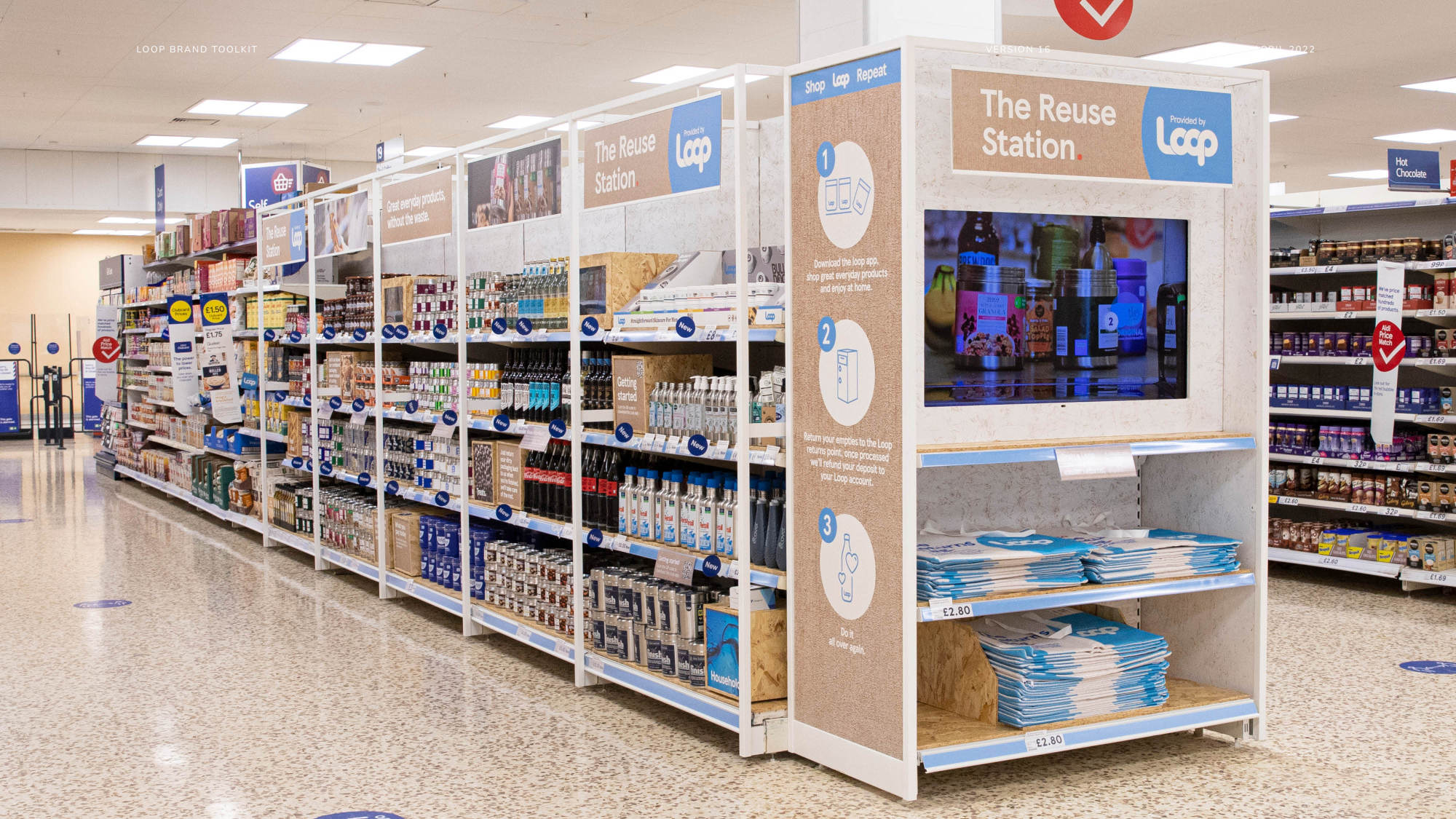
The Return Point is a cornerstone of the Loop experience, guiding customers through the process of returning containers and reclaiming their deposits via the Loop Deposit App. While these bins are customizable for retail partners, our design principles ensure they remain effective:
• High-visibility messaging recognizable from a distance
• A call-to-action to download the Loop Deposit App
• Step-by-step return instructions integrating the bin and the app
• A concise statement explaining how the Loop reuse system works
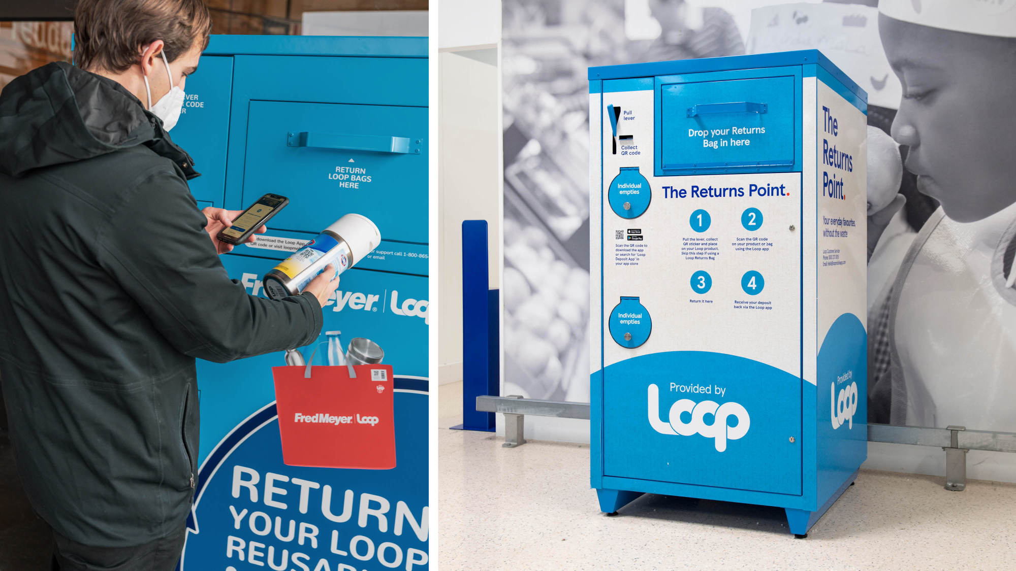
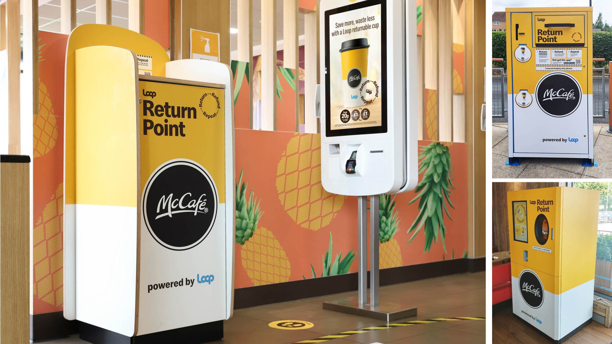
Different Return Point designs serve different environments. Compact bins integrate with restaurant waste sorting stations, while larger smart bins suit high-traffic areas. Outdoors, durable analog bins provide a practical alternative.
The introduction of these standards had an immediate impact. Internally, our designers had a clear framework to work within, reducing inconsistencies and streamlining creative output. Externally, our partners were better equipped to align their campaigns with Loop's identity, ensuring that the brand remained visible and recognizable across all collaborations.
With each new execution, from digital interfaces to packaging labels to retail environments, Loop's identity became stronger, more unified, and more effective in communicating its mission. The result was a scalable system that could grow alongside Loop's expanding partnerships, reinforcing its role as a leader in the reuse movement.