IKEA credit card visual direction
After a 10-year gap during which IKEA offered no financing services to their customers, they were finally positioned to launch two new and competitive credit card offers. While there were internal guidelines established at the global level for how to market these offers, they did not align with established best practices for the US market.
Our task was to redefine the direction for marketing the credit card offers and to deliver credit card communication standards that would be applied in the store, on the web, as well as other channels.
This project was a close collaboration between IKEA and its external credit card marketing partner. I had the opportunity to lead the creative direction, as well as manage the details as designer, copywriter, and finally as project manager when rolling out the in-store implementation.
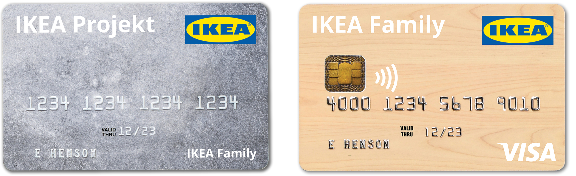
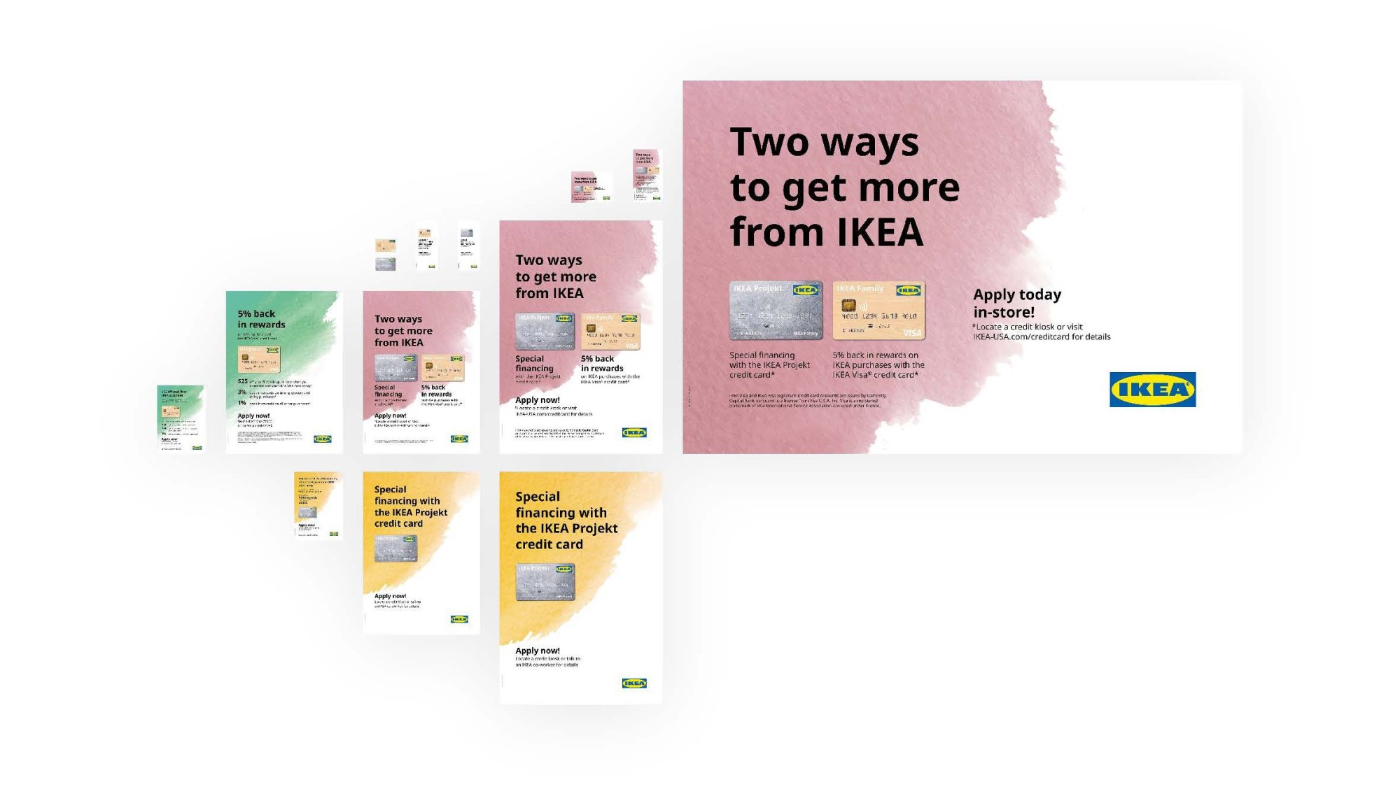
I rapidly developed card artwork that would visually represent each of the two offers, with the understanding that this would be the first simple step in a longer, more rigorous journey.
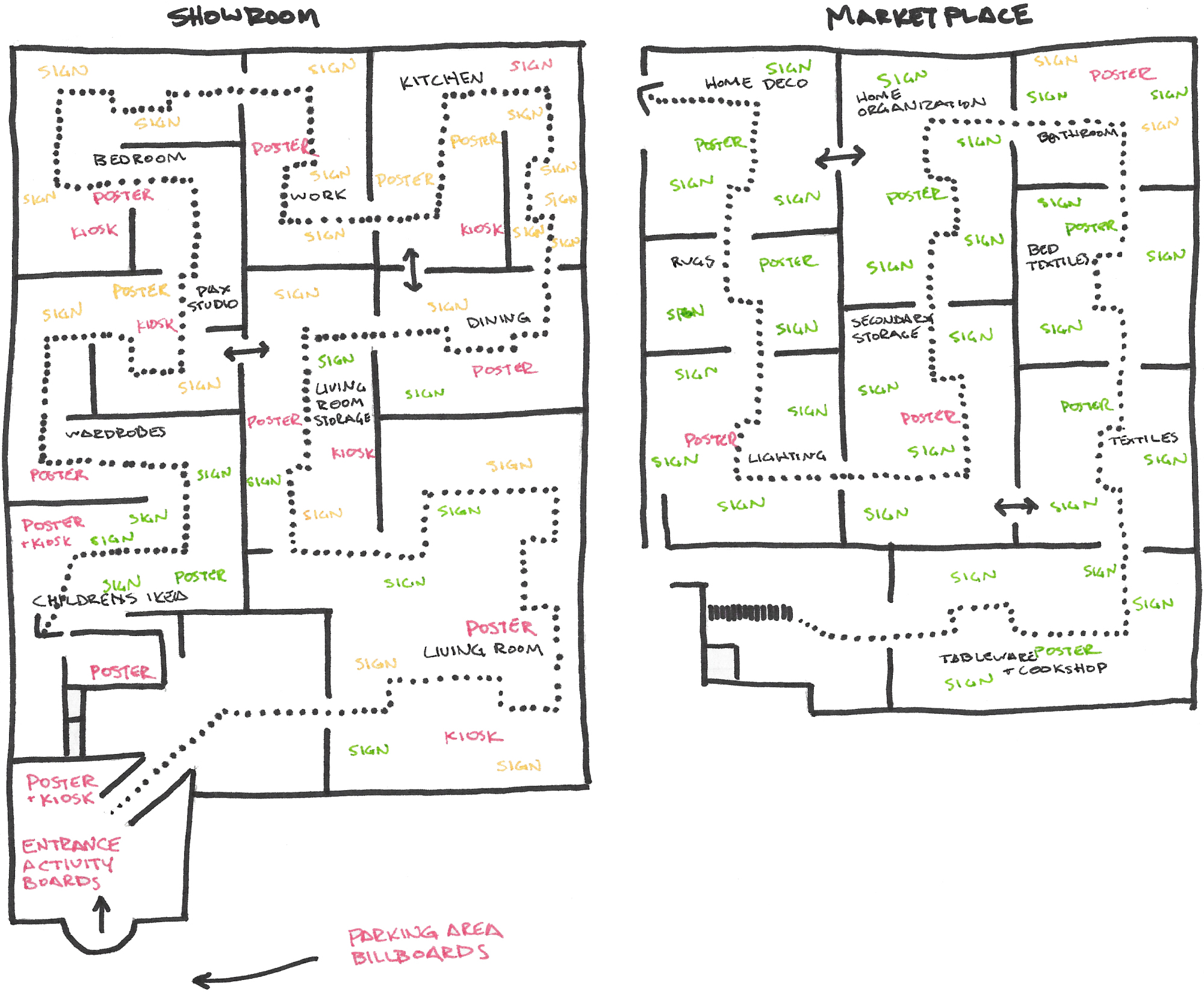
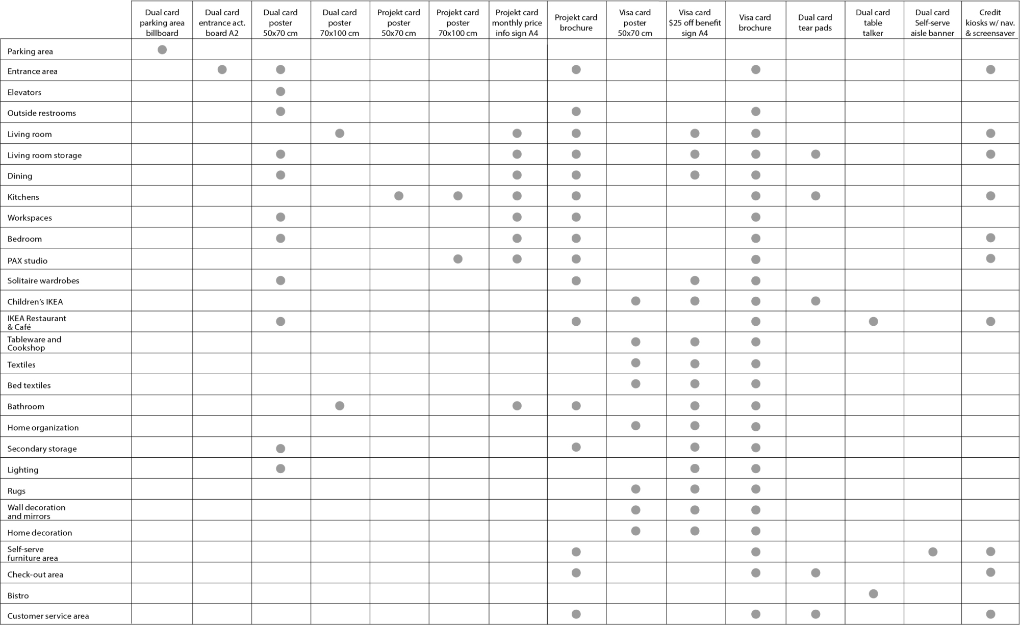
Knowing that we were going to be breaking some rules and diverging from the typical IKEA way of doing things, I identified where these messages would sit within the IKEA communication model and mapped out the complete customer journey. This laid the groundwork for determining where and when we would communicate (which customer touchpoints), as well as how we would communicate (messages and formats).
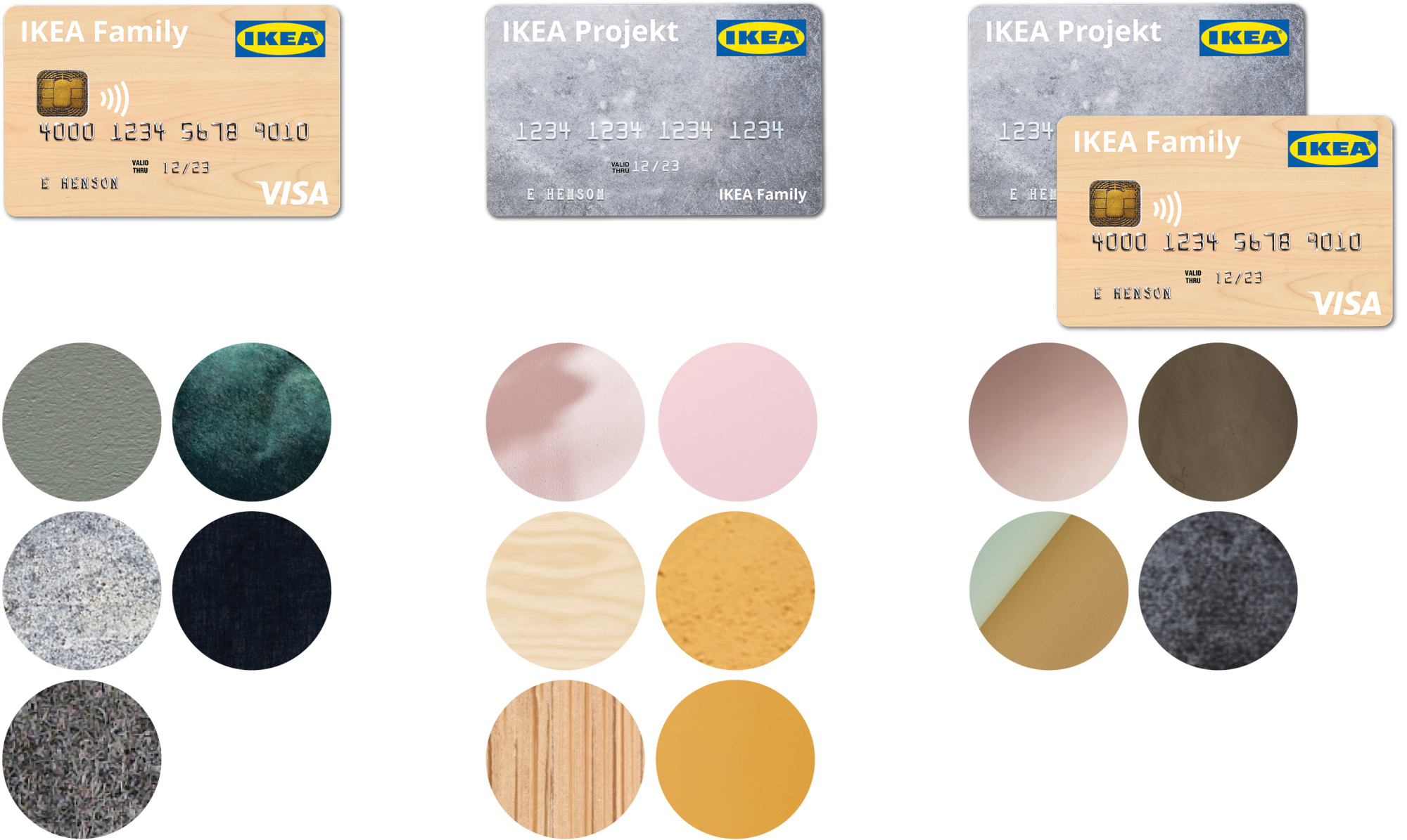
Stakeholders in sales and customer experience helped to position the credit card offer as a service that would be used to support and drive the sale of home furnishing products. With this in mind, credit card communication could naturally be grouped with other services, and communicated to customers using the same strategies and techniques. While IKEA services are consistently identified using pictograms, our external credit card marketing partners insisted that it is a proven best practice to use photographs of credit cards rather than pictograms. This was further reinforced by the need to visually distinguish between the two different credit cards in separate instances.
With our cards designed and in production, a communication package and project plan finalized, we were on target to implement on the web and in-stores on time for the program to launch. After the offers running for about nine months, our in-store sign-up goals and sales targets fell short compared to the web. We set out to investigate what opportunities there were to improve. Using customer flow studies and feedback from IKEA employees on the sales floor we determined that the communication was not visible in the visually complex environment of the IKEA store. We also discovered that customers preferred using store kiosks to apply for cards instead of using their personal mobile devices, whereas the opposite tends to be the case in other retail case studies. Reports indicated that customers sometimes struggled to find kiosks without help from a sales employee.
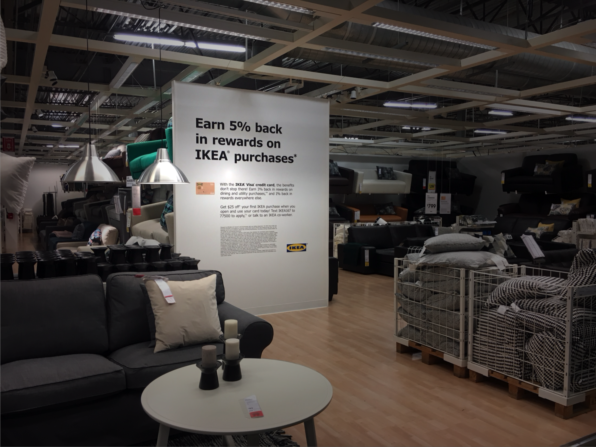
With evidence concluding that in-store communication was underperforming as a result of poor visibility, I set out to reimagine how to more effectively attract customer attention. I assessed design decisions made around placement, format, and message. Larger formats like wall graphics were replaced with smaller formats such as posters and signs that could be used in higher quantities. But ultimately we landed on the visual design as the primary opportunity.
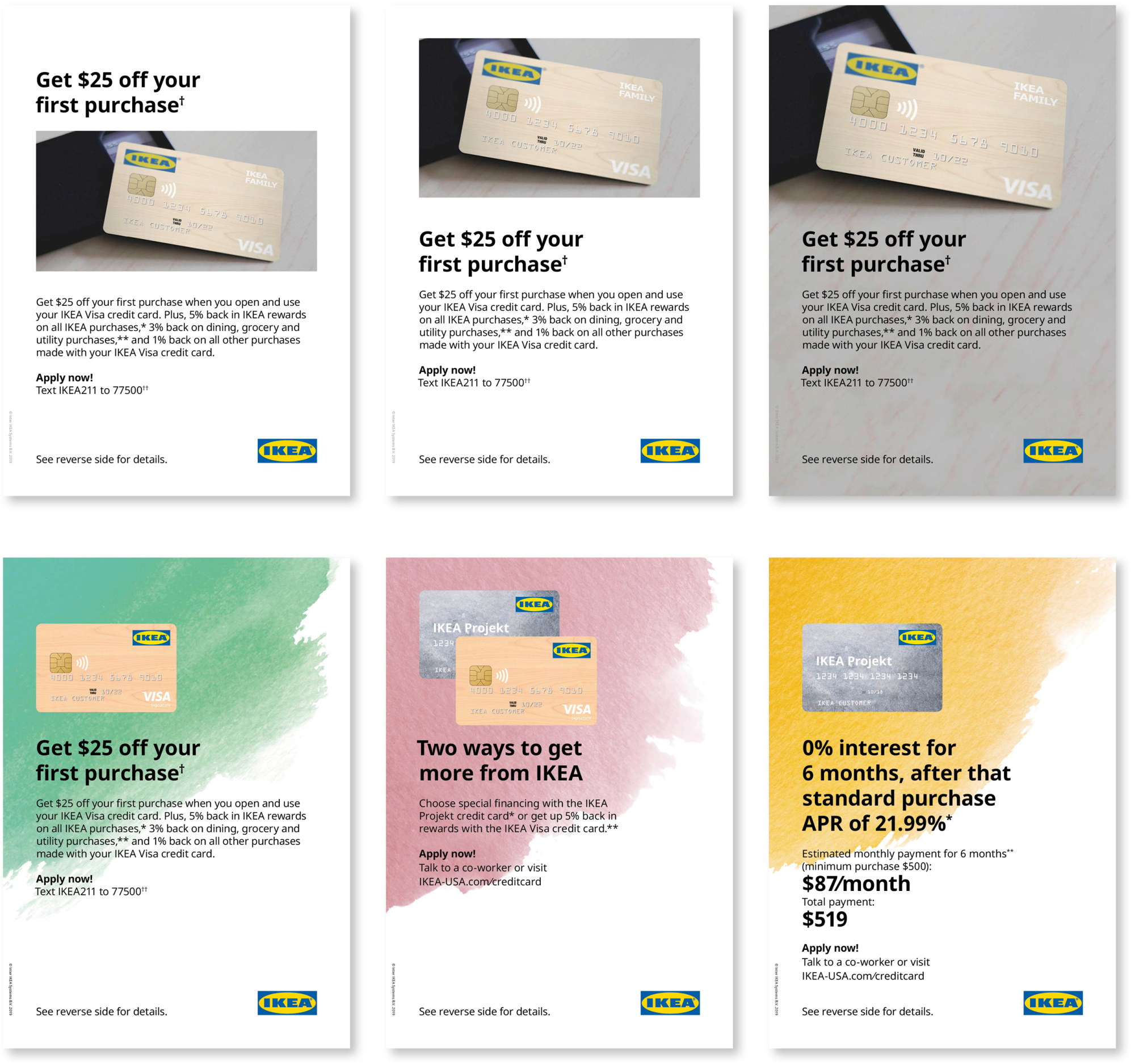
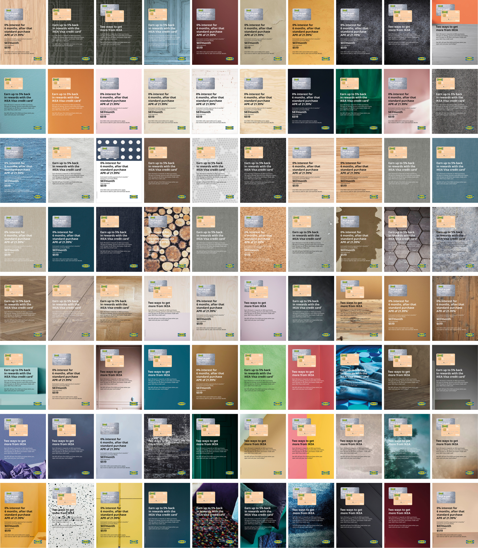
After a period of ideation, we decided to pursue and test two new visual design directions:
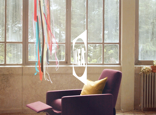
• using photography to build visual interest and context
• adding color and texture backgrounds to help the messages stand out in the store
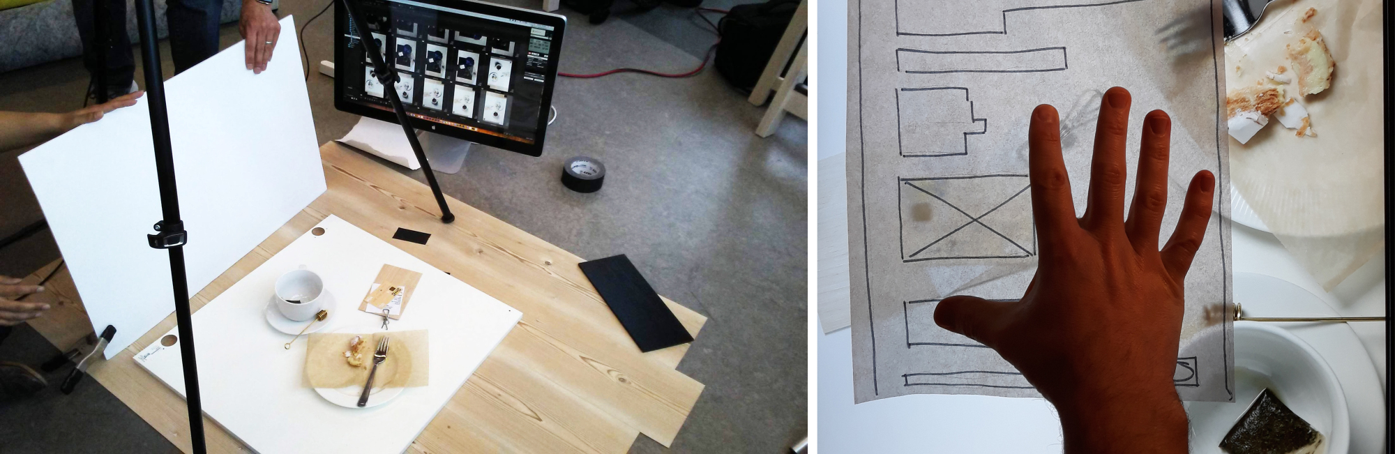
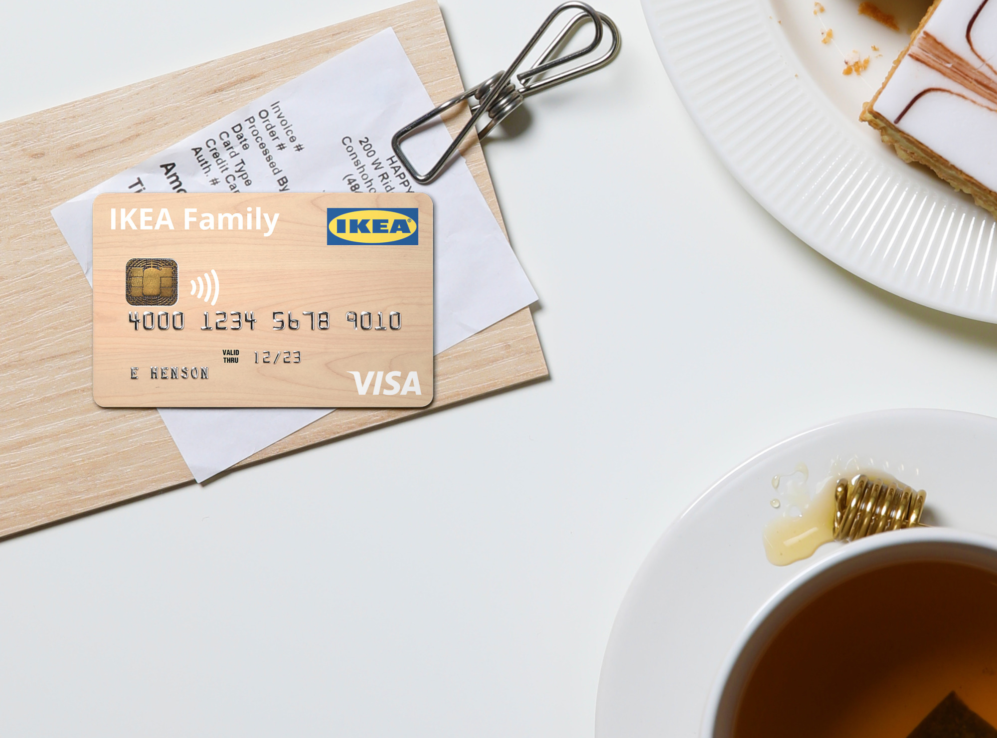
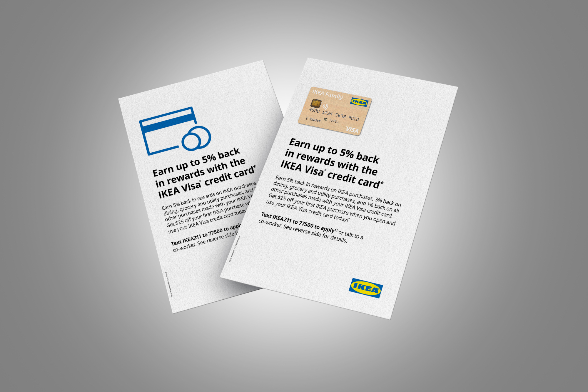
I brought in an external photographer and an IKEA colleague to support as stylist, and together we organized a photoshoot. Since the formatting and typography had already been designed, we were at an advantage in setting the composition to fit perfectly. A quick sketch on trace paper allowed us to block out areas that would need to be reserved for other graphical elements. With two separate visual solutions fully fleshed out, we decided to prototype each set and run an A/B test in the store environment.
Results from the A/B testing showed that the simple color/texture background solution more effectively increased visibility than the photo/contextual solution. We moved forward with having stores transition from their old communication package to the new package. In many cases this was a like-for-like swap from old to new, so the transition went smoothly.
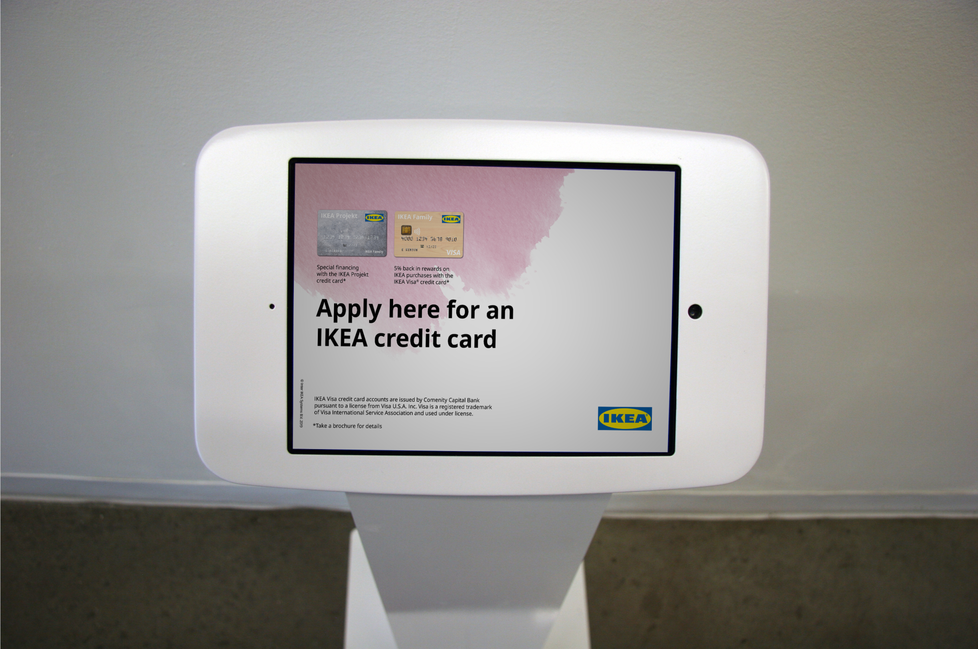
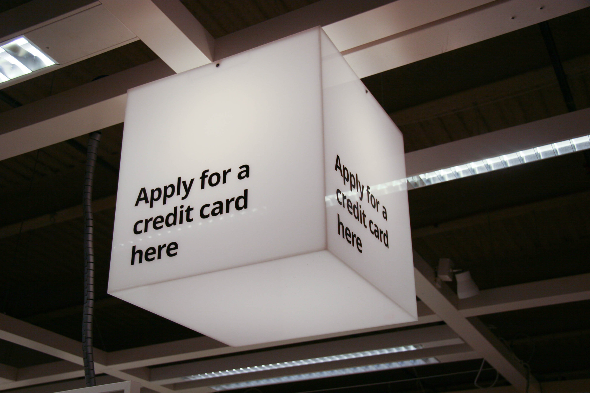
Analyzing the data collected around card application, we decided to increase the amount of credit card kiosks throughout the store and design custom lightboxes to help customers find them.
The new campaign creative resulted in an average:
• 9,800 applications per month
• 5,000 new accounts per month
• sales increase of $13.8M per month